12th January 2021


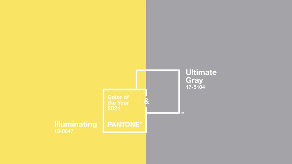
This month, Pantone announced the colors they have chosen as the colors of the year for 2021. They are Ultimate Gray and Illuminating, a beautiful combination of dull, familiar gray and the bright yellow of lemon skin. This choice is based on the past year of quarantine. A time in which we had to envelop ourselves, disconnect from the world, and curl up in blankets at home.
The combination of these colors described the sadness, cloudy skies, empty sidewalks, low- screen lights by the color gray. Whereas, the yellow is the bright, illuminating light at the end of a dark tunnel. The gray color evokes our collective feelings we all experience over the past year. It’s a depressing summation, the sadness and the state of being hopeless. During nine months of quarantine, we’ve certainly arrived at the ultimate gray. Grayness doesn’t point towards ending, it signifies the continuation of a sad and indefinite period. Now with coronavirus cases still mounting all over the world, that’s certainly where we’re at.
Illuminating is a radiant and sparkling yellow sparkling with enthusiasm, a warming yellow shade imbued with solar power. Ultimate Gray, on the other hand, is symbolic of solid and dependable elements that are everlasting and provide a steady and firm foundation. The ultimate grey highlights the ability to stand the test of time. Ultimate Gray quietly assures, encouraging feelings of composure, steadiness, and resilience.
“The selection of two independent colors highlight how different elements come together to express a message of strength and hopefulness that is both enduring and uplifting, conveying the idea that it’s not about one color or one person, it’s about more than one,” commented Leatrice Eiseman, Executive Director of the Pantone Color Institute. The combination of Ultimate Gray with the vibrant yellow Illuminating displays a message of positivity supported by strength and determination. Practical and rock-solid but at the same time warming and optimistic, this is a color combination that gives us resilience and hope. We need to feel encouraged and uplifted, this is essential to the human spirit.
Now when it comes to logo design, the best logo design company in the USA believes that using Pantone colors is the best way to provide their customers with awesome work. Why do the best logo design company in the USA heavily rely on Pantone colors instead of depending on other process colors? Well, the answers? Precision, consistency, and reproducibility.

In the color psychology of logo designs, from bold neons to mellow pastels, to dusky mustards, this sunny color comes in several shades. Yellow is a warm color, remarkably bright that brands usually use to transmit the feelings of friendliness, cheerfulness, and happiness in the audience through their logo designs. The yellow color is associated with summer, sunflower, and sunshine, and if your business wants to transmit youthful energy go with a yellow logo design. Well, most customers do not associate yellow with maturity, sophistication, or luxury brands, therefore, brands really have to think twice for which industry they are getting a yellow logo made otherwise, it can put the entire brand in a negative spotlight.
The yellow color is mostly used in constructions, dating, and the food industry. Thus, to stand out in this cut-throat market, a brand has to necessarily hire the best logo design company in the USA. Some famous brands using yellow or gold for their logos are McDonald’s, Cadbury, and Rockstar Gaming. Yellow is the perfect color choice for a brand looking for a fun, youthful, or whimsical logo. The use of yellow in logo designs creates a light and friendly atmosphere and evokes feelings of warmth and inspiration.

This color goes best when you with minimalism. The Ultra-chic minimalist logos have enjoyed a wave of popularity over the past few years. In a beautiful evolution, it seems artists have grown weary of taking minimalism so seriously. The modern, whimsical minimalist designs keep the less-is-more aesthetic and execute it with a sense of warmth and humor. All minimalism decreases its subject to just the visual essence. This makes minimalist logos very adaptable to a wide variety of backgrounds and mediums – making them very useful and functional.

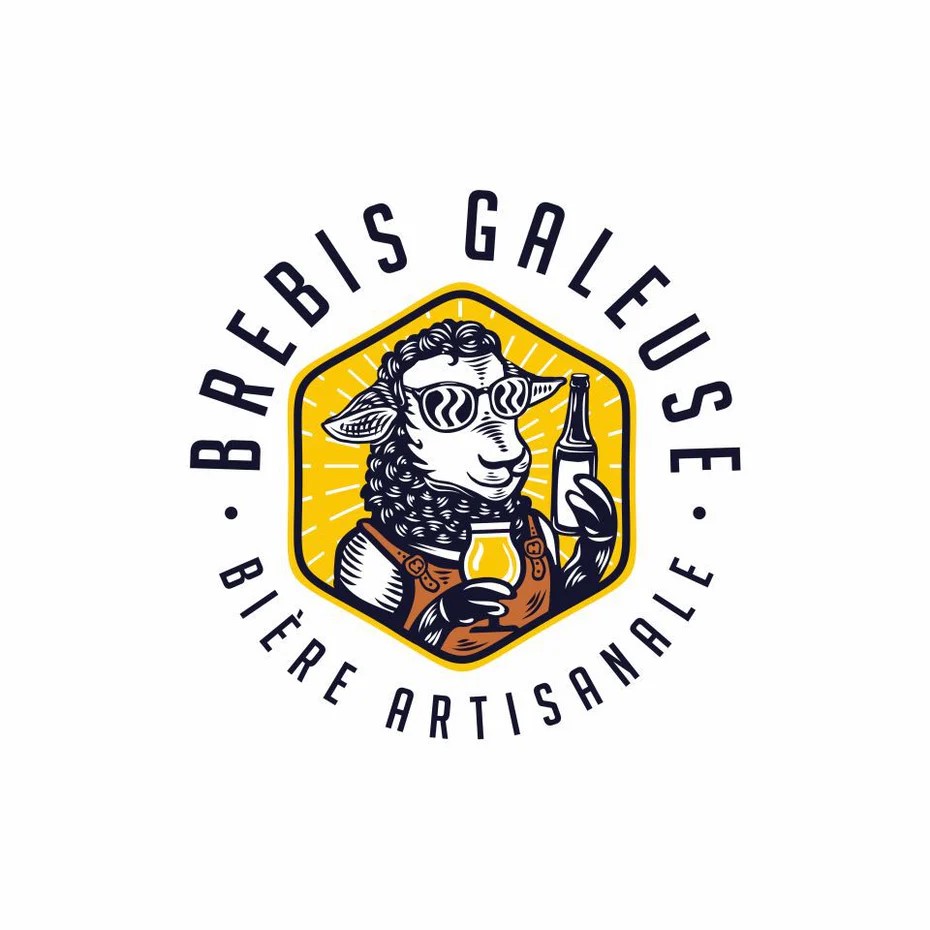
While several logo designers are leading the charge in representations of real people, many others in 2021 are opposing this by engaging with caricature and exaggerated humor. The world is seeing a rise in mostly illustrated logos that present witty with unusual concepts. Businesses that deal in comfort or entertainment are looking to put their audiences at peace. Thus, the designers are responding with logos that have illustrations. Eventually, these whimsical designs make customers feel like they’ve found a friend instead of a brand. Moreover, when the color yellow is incorporated along with whimsical illustrations it radiates happiness, friendliness, positivity.

Not very dark, not very light. Gray is the middle ground of mature, classic, and serious. It’s a pretty flexible color. A designer can go darker to add mystery and even can go lighter to be more accessible. Gray logos have a stark simplicity. Just because it’s softer, it gives a more serious, muted vibe making the gray logo design a classic. A prime example of this is Apple.
Gray logos fall in between of the absence of light that is completely black and full light, white. This makes it a prominent color to have in mind for the logo if the best logo design company in the USA is going for mature, classic, and serious qualities. Moreover, Grey color in logo design can be linked with feelings of professionalism, dignity, classic, modesty, and stability.
Since every site has two coins, the gray logos also can be associated with boring and ordinary logos because of the absence of color, that is why the best logo design company in the USA use gray to create a sustainable brand personality because of the fact that gray is not warm or cold, and is not masculine or feminine, as it’s a completely neutral color and one can use it as a good brand personality trait.
Gray color in logo design is very popular amongst equipment, transport, IT, finance, and hi-tech companies because it makes them feel formal, professional, sophisticated, and credible. Some famous brands using gray logo examples are Apple, Audi, or Mercedes.

Gray can be largely used in typographic or also knows as logotypes. Logos that entirely made up of letters with no icon at all.
Moreover, the designers have grown bolder. They have a wide variety of font choices that appear in the logos. It’s not the same or simple anymore that you plop your business name under the logo mark in a serif or sans serif font like Helvetica or Times New Roman and call it a day. NayNay, now the best logo design company in the USA gets creative and creates personalize fonts for the design.
The beauty of this is its flexibility. There are so many strong fonts available to choose from and when they are accompanied with grey color– there’s bound to be a fascinating logo design that will suit the unique brand.

Another way to use grey color in logo designs is by incorporating line art. It is remarkably versatile and creates a timeless logo design. These traits automatically make line art a strong option for a logo and the sophistication, authority, ad power the grey color brings in logo design is amazing.
From clean geometric line drawings to suggestive gesture logos, we’ve seen artists ramping up their creativity and reinterpreting what a line art logo can be. This is only the beginning, with passing time the art will find its balance
Line art’s simplicity is a natural response to the vibrantly colored gradient logos that have taken over our computer monitors for so long. Since people need calmness and solace, I believe line art will continue to gain popularity in the coming years. This is refreshing, elegant, and flexible. Such logos can be rendered on virtually any background. And, with the nearly endless array of styles in which they can be executed, a brand will surely find one to match their brand’s tone.

Finding the right color combination for the logo is very important. The professionals working at the best logo design company create the right combination that sets the mood for the branding and helps the brand to stand out from the rest of the competition in the digital marketplace. In the beginning, it is really important to think about what kind of logo is design is required. Therefore, it’s a good idea to study the design style out there and the type of color combinations that similar rivals are using.
A lot of companies fail to do this properly and ignore the design analysis process before jumping right into the design aspect. This can lead to the logo not being adapted to the industry. Further, It may lead your customers into thinking that the company does not deal with the type of service that they are looking for or even worse, not wanting to work with you at all. Thus, understand that colors are very crucial when designing the logo as it will stick with the brand throughout time.
Apart from using these two colors separately, designers have created some masterpieces where both colors are complementing each other. A lot of yellow, if not well designed, can lead to negative feelings, fear, low self-esteem. Therefore, it is best to use the color yellow in a balanced way in the logo designs.

Yellow and grey logos evoke feelings of creativity, ambition, and warmth. These two colors sit directly opposite each other on the color wheel, these two colors are complementary. By pairing yellow with its complementary color, you create contrast and add a strong visual impact to your logo. Further, this color combination also evokes feelings of energy, sophistication, and intrigue. Grey works well as a background color, restricting the logo’s design while yellow acts as an accent. If a brand really wants their yellow to truly shine, use it as your logo’s background color and save the grey for the fonts.