2nd December 2020


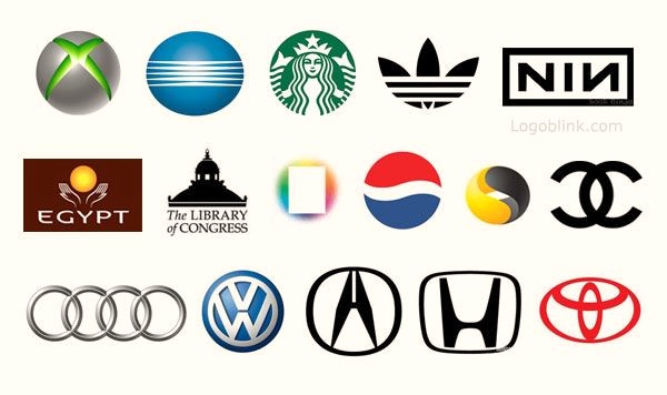
Well-designed symmetrical logos have become an intrinsic part of any modern brand. They symbolize equilibrium and a centrally-featured design for brands to put upfront on their websites, advertisements, products, and stores.
According to HBR’s study, “Apparently, 95% of brands have symmetrical logos based on their analysis of major 423 brands.”
Symmetrical logos are easy to recognize even by toddlers who are too young to tie their shoelaces. It’s because people deem symmetrical shapes more attractive than asymmetrical ones. Hence, it can be highly significant to maintain the symmetry of logo designs for your brand.
If you’re interested in knowing how a professional logo design company in Los Angeles maintains symmetrical logo designs, here are a few tips to help you out.
Identifying both symmetrical and asymmetrical logos is instrumental in creating the perfect logo design for your company. The symmetry in logo designs evenly distributes itself in alignment with the central vertical or horizontal axis. Generally, symmetrical business logo design balances identical forms from both sides of the axis.
In contrast, an asymmetrical logo design doesn’t have any determined composition weight on both the axis. It has several forms and an informal balance that creates a stronger visual tension among people.

For a professional logo design company in Los Angeles, it’s vital to understand the difference between both types of logo designs. This will help in implementing an accurate grid and symmetry to any logo design.
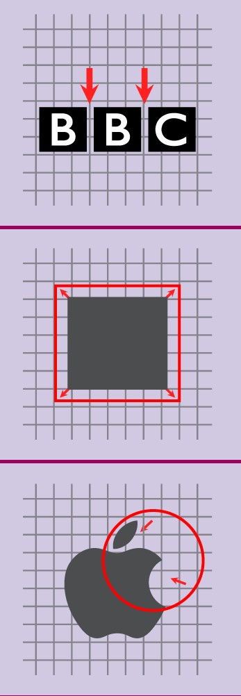
Prominent brands such as ‘Apple’ have applied the golden ratio rule to its logo design to give a symmetrical impression on its overall appearance. Form a ‘grid’ and draw a sketch first before the development of your business logo design.
Grid is a tool that encompasses horizontal and vertical lines to equally distribute the geometric shapes and letters before turning them into eye-catchy logo designs. It’s useful for maintaining the symmetry of your logo design.
Here’s a fascinating video by Yahoo that reflects on the importance of relying on the grid for symmetrical shapes.

If you’re hiring a professional logo design company, ensure that their affordable logo design packages include the golden ratio rule to build a memorable emblem for your brand.
A pro tip is to determine the safe area first before creating a logo design. The ‘safe area’ is where you leave the spacing between the letters and horizontal or vertical gridlines. Ensure that you’re leaving enough space for your business logo design to adjust itself, keeping all the sides balanced to give a symmetrical touch.

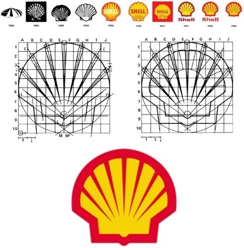
For instance, the major petroleum company Shell has an organized and unique symbol that maintains ‘symmetry’ from all sides. The company has cleverly marked the safe areas and circled their logo design in a sketch before transforming it into a real logo design.

The art of maintaining the symmetry of logo designs rely heavily on these gridlines and safe areas. So, if you’re a professional logo design company in Los Angeles, ensure that you choose your design dynamics wisely.
Creating an ultimate symmetrical design requires having a clear purpose for your brand. A modern brand acts as a blueprint for any design and determines the mission, vision, and objectives of any business.
Considering the details in mind, try to brainstorm as many ideas as possible until you reach a satisfactory point to symmetrize your potential business logo design. Understanding your brand’s purpose will help you become visually smart to experiment with different ideas before turning them into a real design.

If you’re a brand owner, the best key to lock symmetry is to create a chart that depicts all your design requirements with your brand’s purpose. It will help you choose relevant ideas to create a stabilized design.
Undergo Gestalt’s visually-organized theory that tells us how people automatically perceive a memorable logo when they feel an instant connection with it. A logo isn’t just a word for them but an iconic symbol, monogram, and more. It’s all related to the design theory that represents the company’s product or services.
Consider an example of Airbnb. The ‘reflection-based’ symmetry logo design of Airbnb is common, yet so many people recall it the moment they set their eyes on it. The color, fonts, and even unique typography allow them to see beyond just a design.

Conduct a test and check which new format or design fits your logo design best and then try some color and pattern combinations to test the water. Think accordingly to design psychology before acquiring any affordable logo design packages for your brand.
Having a symmetrical design doesn’t mean that your design isn’t exciting or interesting enough. It simply means that you want an organized and well-balanced design. Therefore, think creatively and see what your competitors are doing with their logo designs.
Consider running a competitive analysis and a bit of groundwork to ensure that you follow other symmetrical emblems. Research what makes your brand stand out the most and check out different trends on websites related to any professional logo design company in Los Angeles.

Choose what inspires you and aim to build a better design that is unique and timeless. Check companies like FedEx, Amazon, McDonald’s, etc., to clearly understand the market.
A prototype is a final representation before converting the business design into its real version. Designing a prototype first will help you fix your design’s proportions and symmetrical shapes to attract users’ attention.

If the prototype is exactly what you need, you’re good to go, but if it isn’t what you are looking for, you have the time to decide and change your logo design. Sometimes a simple design similar to FedEx works wonders for your brand. There are many leading design agencies who offer affordable logo design packages and create logos that have the desired impact on your clients.
It takes more than one to build an attractive, organized symbol for your brand. A professional logo design agency in Los Angeles will have a good team to figure out the design elements. However, try canvassing opinions from new people and see if your design is powerful enough for them to recall it too.

It’s all up to the brand how they want people to look, feel, and recall their design. But, it’s also vital to explore what attracts people more by welcoming their feedback. For instance, everybody knows about McDonald’s iconic and symmetrical emblem because it has modified its logo during all these years to captivate people’s minds.
Don’t be afraid to experiment and learn to design a logo that has an impact. From Layman’s point of view, your logo design ideas are extremely essential to work both on your smartphone app and traditional media such as the side of the car.

Be practical about your logo design process and the well-symmetrized business design. Think about how your logo will look like in a wide or tiny space? Is it possible to stitch it onto a garment? Answers all these questions to create a rough mock-up of your equally-balanced logo design.
Designing a logo is exhausting for brand owners. Therefore, a professional design company in Los Angeles can effectively tackle all your design issues and symmetrical needs. They have skilled staff who help you choose fulfilling designs according to your brand’s vision and mission.

A professional design company also offers affordable design packages to help you acquire cheap services. Most of the companies with successful logo designs might have hired a design agency at some point to build interactive well-balanced logos.
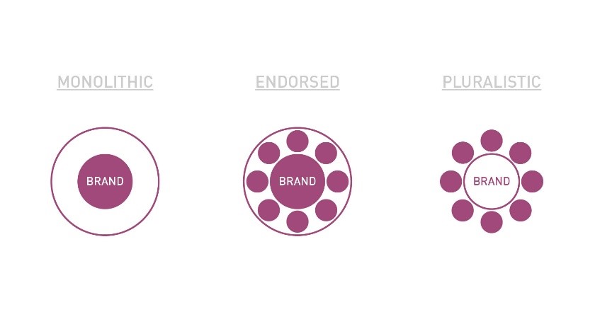
Get a grip on your company’s structure and brand architecture. It will help you come up with consistent concepts for your business logo design. See the bigger picture here, such as the fundamental framework of your organization, or does it have sub-brands or several different brands?

Divide your business structure into the following categories:
When considering symmetrical logo designs, this segmentation will help you develop a framework for your brand and achieve the best business logo design.
Ultimately, immaculate logo designs with a definite symmetry have no concrete formula or sure fire-way. You just need to make a difficult choice to see what fits with your brand persona. Try to make compelling CTAs and optimize content to build a strong logo design.

Get inspired by trying different design concepts and bringing creativity in your logo designs by taking up affordable design packages to see where you stand. Remember, a symmetrical logo design is almost invisible if it doesn’t resonate with your brand persona.
Considering these tips to maintain your symmetry logo design will help you keep up with the current trends. However, the final decision is still yours to make as you clearly understand your brand.
For a more robust artwork, hire a professional logo design company in Los Angeles to help you with sketching and adding a fine equilibrium to your logo design so that you stay on the right track.
Let us know what you think is your favorite design tip among the list in the comment section.